
Primary Research - Victoria's Secret Store MK
January 16, 2019
On Friday 11th January 2019, I decided to conduct some primary research at the Victoria's Secret store in centre:MK, Milton Keynes, Buckinghamshire. From the outside the store is very big and eye catching, using their signature colours of black, white and pink. There is only one window display out front, displaying the iconic angel wings and notice of a sale. Immediately, the bold, red sale sign offering up to 70% draws the customer in.

Upon entering the store, the strong brand image is immediately recognisable. With marble black and white flooring and velvet furniture covering the store, Victoria's Secret definitely has an expensive feel about it. The store feels like a boudoir, as shown with the dim lighting and dark walls, however it does not feel unwelcoming. All of these things put together help portray that Victoria's Secret is an underwear shop, which is successful for their brand image.

One thing I did notice was the array of monochromatic images of the Victoria's Secret 'angels' in suggestive poses scattered across the walls. Of course, the models are a key part of their brand image, hence why there are constant videos of the annual Victoria's Secret fashion show playing behind the checkout.


One of Victoria's Secret's biggest selling points is their fragrances. I noticed that the body range in the Milton Keynes store were not only displayed very well, but were also situated right by the tills. This might be a strategy used by VS to sell more of their toiletries, as they are something you could just pick up on your way to paying for the rest of your goods.

Throughout the store, the same colour scheme of pink, white and black is repeated. Again, this contributes to VS's strong brand image and helps to tie together the stores all over the country, whilst also communicating the expensive, girly vibes that is iconic to the Victoria's Secret brand.


What's interesting to me is that I noticed they were selling similar items, but in completely different ways. For example, the underwear displays in PINK were bright and inviting, whereas the underwear displays in Victoria's Secret were dark but sexy. The same occurred with the body care displays too and also the changing rooms, as shown in the photos below.
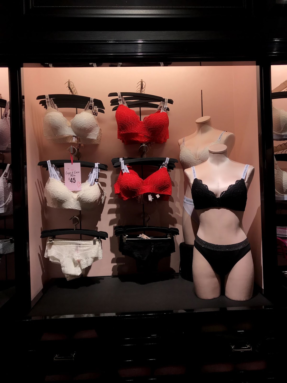

Underwear displays in Victoria's Secret vs PINK


Body care displays in Victoria's Secret vs PINK


Changing room entrances in Victoria's Secret vs PINK


0 comments